Appendix 1: course attendance
The idea presented behind the course fee is that it will help registered participants to actually show up.
Course attendance is a known problem. Ideally, we want it to be 100%, i.e. that all learners that register for a course show up. In practice, for this is what it may look like in practice:
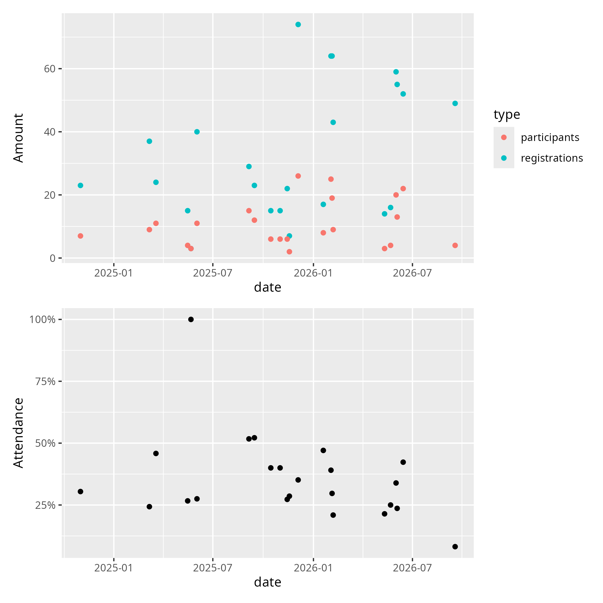
Figure 1: course attendance. See the procedure below to see how this figure is generated.
By eyeballing (and ignoring the 100% outlier, where 3 out of 3 showed up) we see that in those course we expect around 1 in 3 registered learners to actually show up. Although this figure shows the problem of a less-than-100-percent-attendance rate, it also shows a solution to this problem that is used at NAISS and UPPMAX: they estimate how many will show up.
Procedure
I went through all the courses I teach and checked for all courses that collect data on both the number of registrations and attendance. Then I copy-pasted the data that was easy to obtain to this document, including a link to where I copy-pasted the data from.
From this,
I created the data file attendance_rates.csv
(also, from a copy-paste, then some quick ruthless editing).
The plot was created by the script
create_attendence_plot.R.
Bianca workshops
| Course | Iteration | Course date | Registered | Showing up | Evaluated |
|---|---|---|---|---|---|
| Beginner | 4 | 2025-03-19 | 24 | 11 (46%) | 11 (100%) |
| Intermediate | 4 | 2025-05-22 | 3 | 3 (100%) | 2 (66%) |
| Beginner | 5 | 2025-09-15 | 23 | 12 (52%) | 8 (67%) |
| Intermediate | 5 | 2025-11-18 | 7 | 2 (29%) | 2 (100%) |
| Beginner | 6 | 2026-02-06 | 43 | 9 (21%) | 8 (89%) |
| Intermediate | 6 | 2026-05-22 | 16 | 4 (25%) | 2 (50%) |
| Beginner | 7 | 2026-98-17 | 49 | 4 (8%) | ~3 (~89%) |
Intro to UPPMAX
| No | Date | Registered | Showing up | Evaluated | Notes |
|---|---|---|---|---|---|
| 3 | 2025-10-15 | 15 | 6 (40%) | 6 (100%) | Online |
| 4 | 2026-01-19 | 17 | 8 (47%) | 5 (63%) | Online |
NAISS Transfer 102
| No | Date | Registered | Present and active | Evaluated |
|---|---|---|---|---|
| 1 | 2026-05-11 | 14 | 3 (21%) | 3 (100%) |
Linux Command Line 102
| No | Dates | n_reg |
n_learn |
n_eval |
|---|---|---|---|---|
| 1 | 2025-06-02 and 2025-06-03 | 40 | 11 (28%) | 11 (100%) |
| 2 | 2025-12-04 and 2025-12-05 | 74 | 26 (35%) | 15 (71%) |
| 3 | 2026-02-04 | 64 | 19 (30%) | 13 (68%) |
| 4 | 2026-06-03 | 55 | 13 (24%) | 7 (54%) |
Programming Formalisms
| Date | Number of registrations | Present and active |
|---|---|---|
| Autumn 2024 | 23 | ~7 (30%) |
| Autumn 2025 | 15 | ~6 (40%) |
Connect and File Transfer
| No | Date | Registered | Showing up | Evaluated |
|---|---|---|---|---|
| 1 | 2025-03-07 | 37 | 9 (24%) | 8 (89%) |
| 2 | 2025-05-16 | 15 | 4 (27%) | 3 (75%) |
| 3 | 2025-09-05 | 29 | 15 (52%) | 10 (67%) |
| 4 | 2025-11-14 | 22 | 6 (27%) | 5 (83%) |
| 5 | 2026-02-02 | 64 | 25 (41%) | 15 (60%) |
| 6 | 2026-06-01 | 59 | 20 (34%) | 14 (70%) |
| 7 | 2026-06-14 | 52 | 22 (42%) | 13 (59%) |