Basic workflow overview
Learning outcomes
- Learners have created a plot from data
- Learners heard about the book 'R for Data Science' for things they need
For teachers
Teaching goals are:
- Learners have experienced the steps on how to create a plot from data
Prior question:
- You want to plot data using R. What are the steps to do so?
Goal
Goal of this session
The goal of this session is to experience a full workflow on how to create a plot from data. You will remember the steps you did.
Non-goals are to go into detail what happens yet: instead, each step is described in more detail in the next sessions.
Prefer a video?
Could you give an example?
From this data ...
| Country | 2000 | 2015 | 2030 |
|---|---|---|---|
| China | 1270 | 1376 | 1416 |
| India | 1053 | 1311 | 1528 |
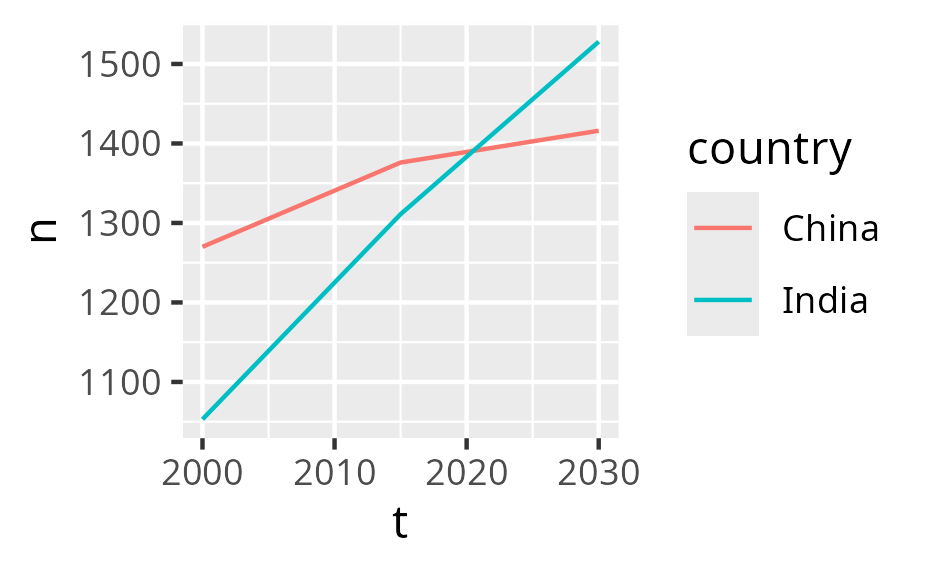
and some R code to create this figure ...
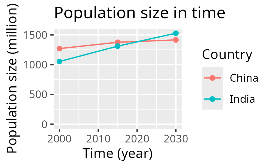
after which the figure (as an SVG) can be worked upon in other tools.
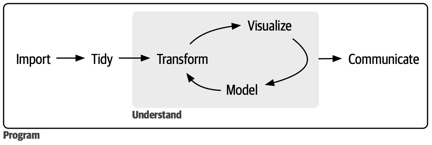
A typical project visualization
You want to visualize past and predicted population size by country, using the data from the Wikipedia article 'World population'
These are the steps:
- 1. Preparing the data
- 2. Reading the data
- 3. Tidying the data
- 4. Cleaning the data
- 5. Saving the plot
- 6. Refine
1. Preparing the data
You (wisely) decide to start with only a subset of the data from the Wikipedia article 'World population':
| Country | 2000 | 2015 | 2030 |
|---|---|---|---|
| China | 1270 | 1376 | 1416 |
| India | 1053 | 1311 | 1528 |
From the context, you understand that:
- the columns with numbers (e.g.
2000) is the years - the values in the cells are the estimated population size, in millions
This data is best saved as a comma-separated (.csv) file.
In RStudio, create a new text file: click on 'File | New File | Text File'.
Where do I need to click?
Click on 'File | New File | Text File':
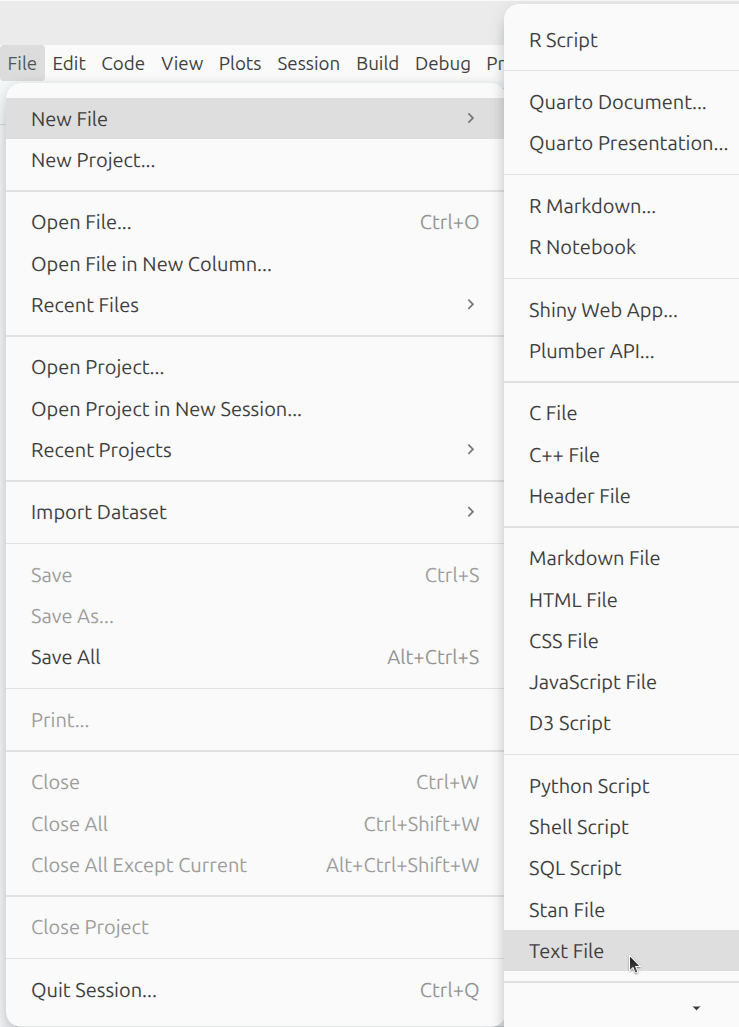
You now have created an empty text file called Untitled1.
What does that look like?
Your screen looks similar to this:
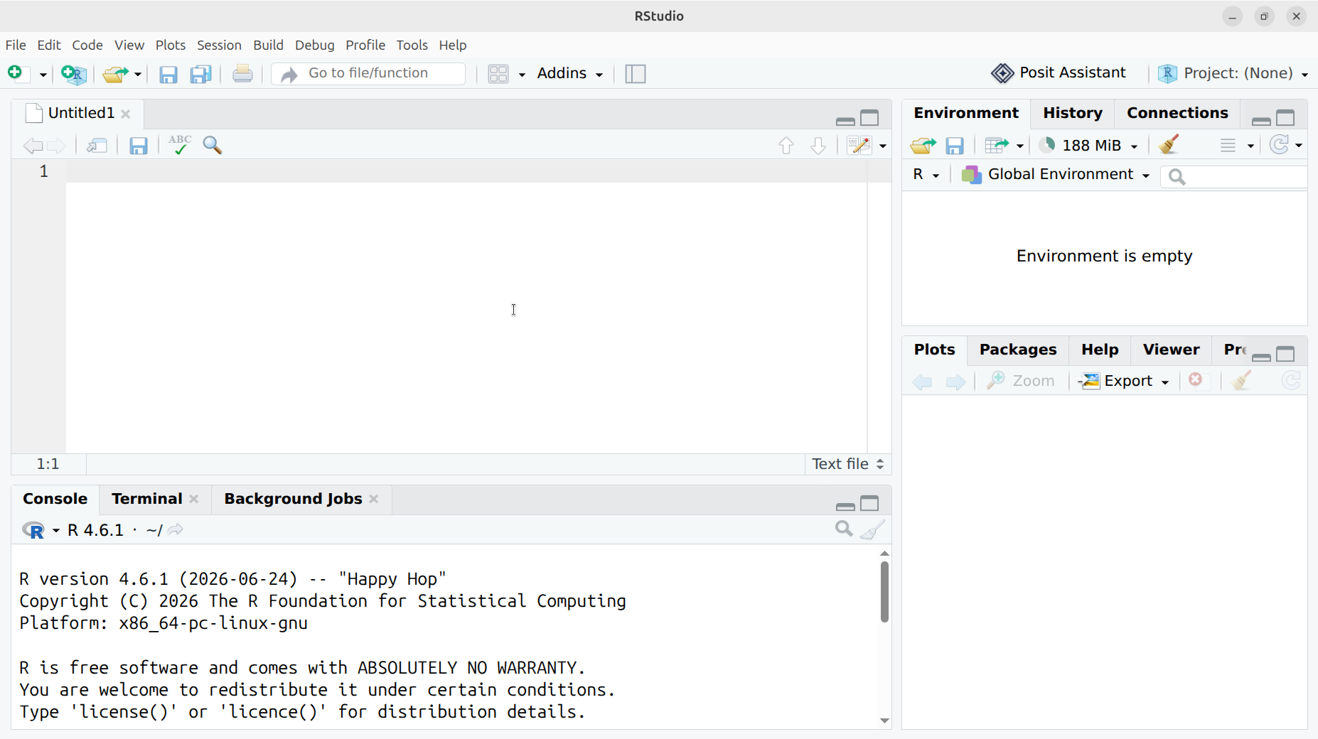
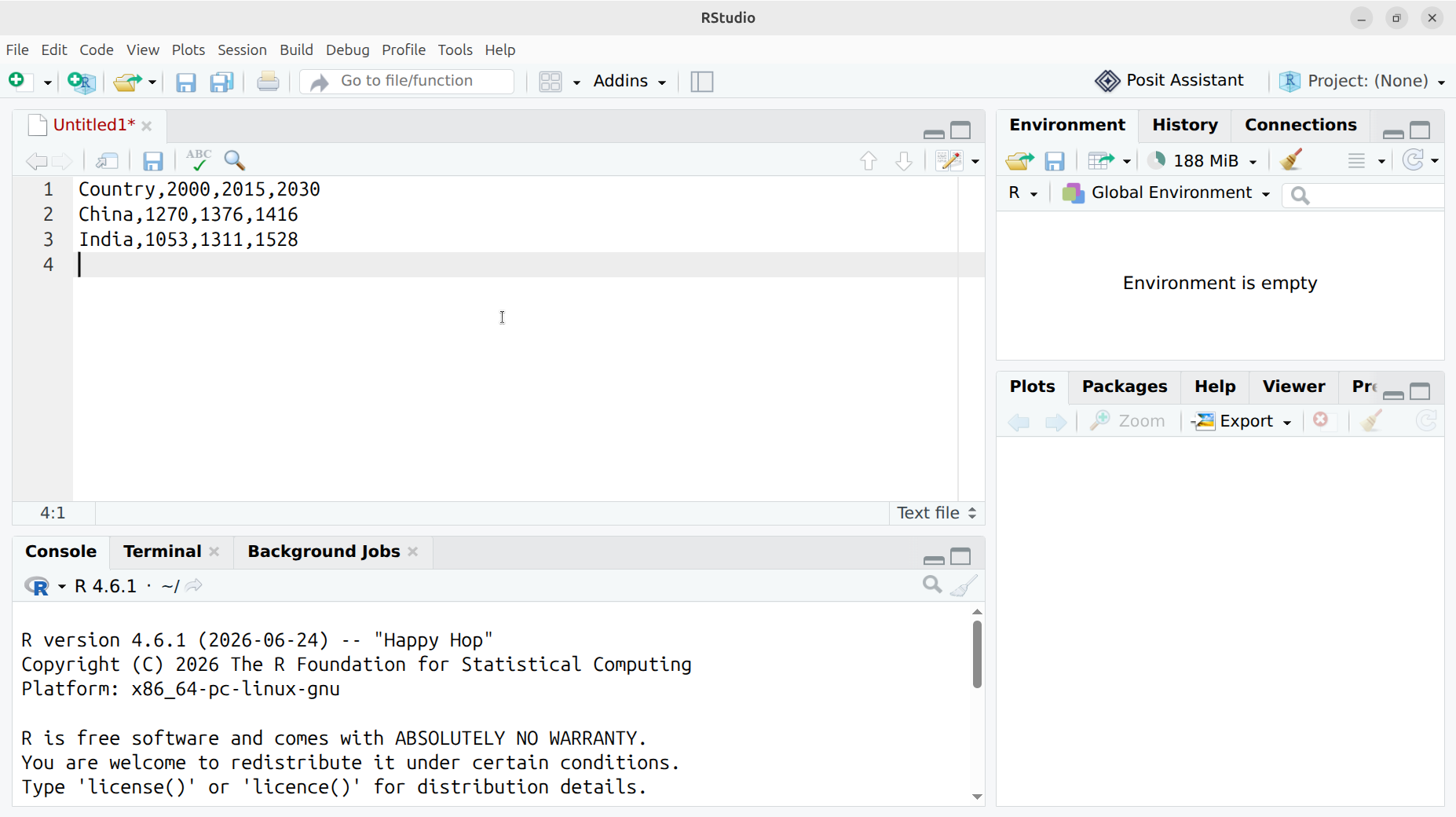
In this file, paste the data as in the table and use commas as a separator, like this.
Country,2000,2015,2030
China,1270,1376,1416
India,1053,1311,1528
What does that look like?
Your screen looks similar to this:
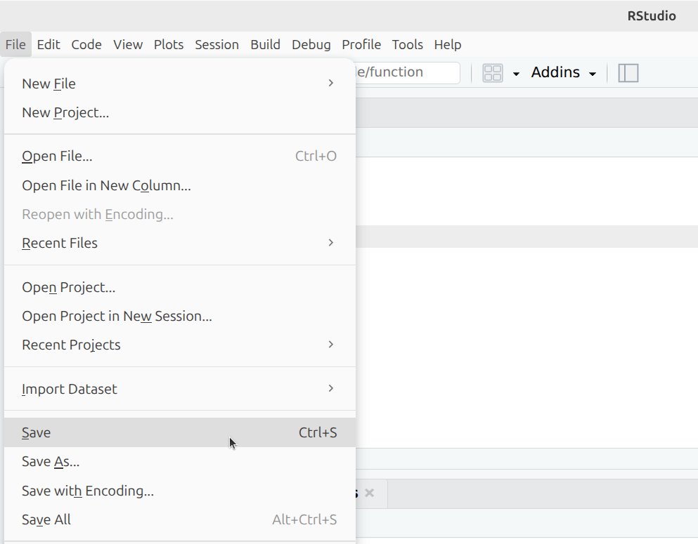
Save this file by clicking 'File | Save'.
Where do I need to click?
Click on 'File | Save':
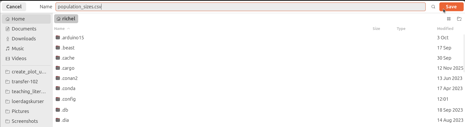
When asked for a name, type population_sizes.csv and click 'Save'.
What does that look like?
This -so called- 'Save dialog' depends on your operating system. You will recognize it, as it is the same as used by your other programs.
If you use Ubuntu, your screen looks similar to this:
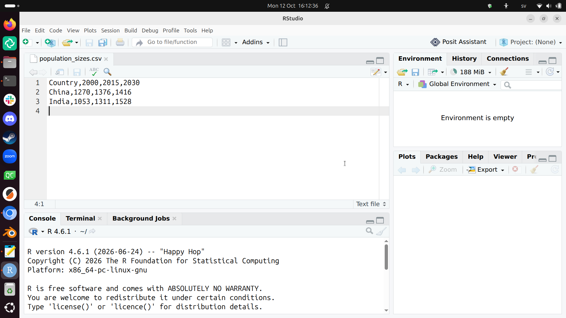
Now you can see in RStudio that your text file is called population_sizes.csv.
What does that look like?
Your screen looks similar to this:
2. Reading the data
To read the data, we create a file that will contain our R code.
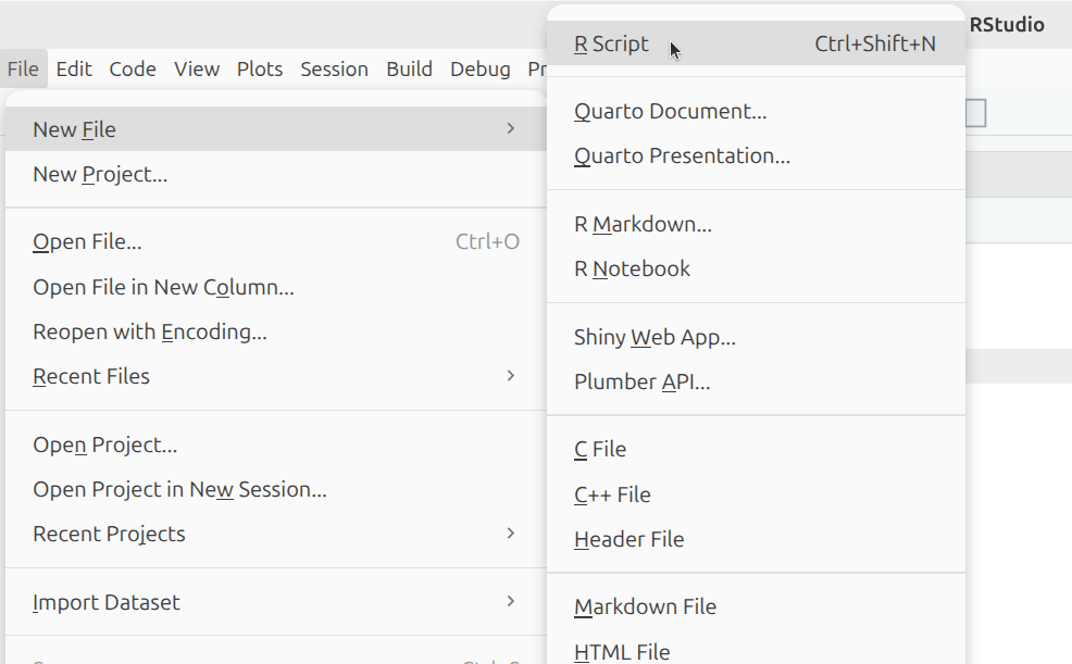
Click on 'File | New | R Script'.
Where do I need to click?
Click on 'File | New | R Script':
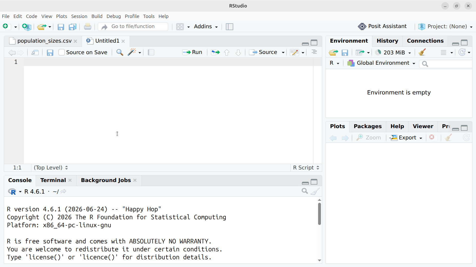
You now have created another empty file called Untitled1.
What does that look like?
Your screen looks similar to this:
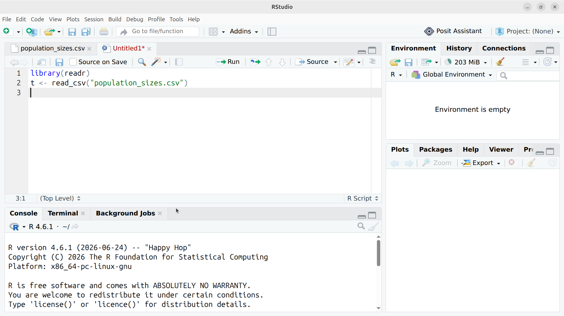
In this file, paste the R code below:
library(readr)
t <- read_csv("population_sizes.csv")
What does that look like?
Your screen looks similar to this:
Save this file by clicking 'File | Save'.
Where do I need to click?
Click on 'File | Save':
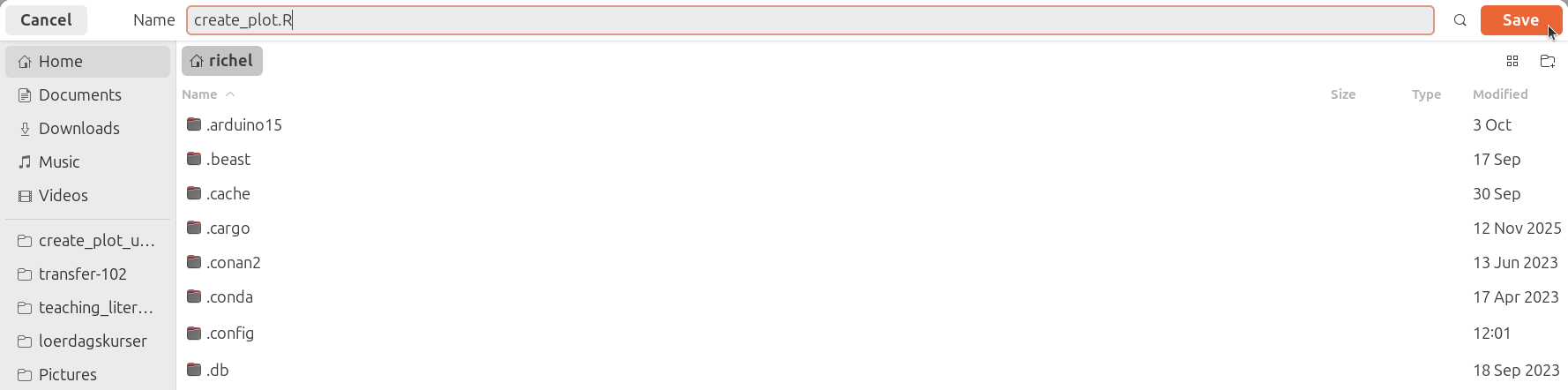
When asked for a name, type create_plot.R and click 'Save'.
What does that look like?
This -so called- 'Save dialog' depends on your operating system. You will recognize it, as it is the same as used by your other programs.
If you use Ubuntu, your screen looks similar to this:
Now you can see in RStudio that your text file is called create_plot.R.
What does that look like?
Your screen looks similar to this:
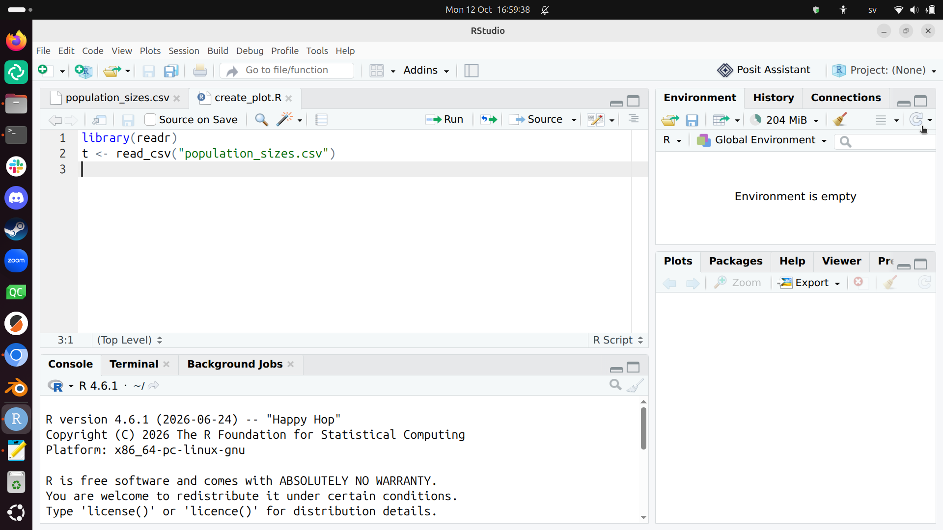
You have now created your first R script. A script is a plain-text file with code.
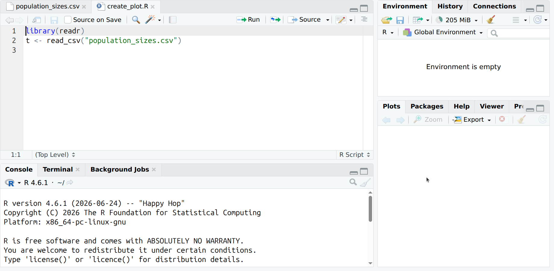
To run the code, put your cursor on the first line and press ctrl and Enter.
What does that look like?
Your cursor at the first line looks similar to this:
After pressing ctrl and Enter, your screen looks similar to this:
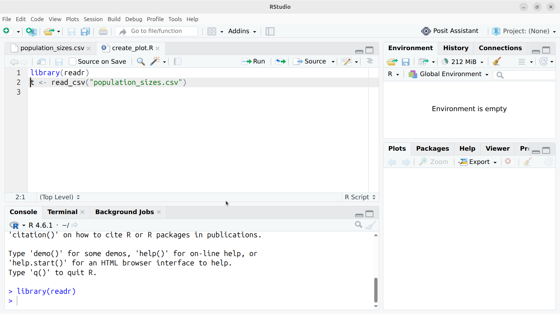
You have just run the code library(readr). This allow you to use code
written by others. In a bit more formal wording:
you have now activated the readr library.
Run the second line too, by pressing ctrl and Enter again.
What does that look like?
This looks similar to this:
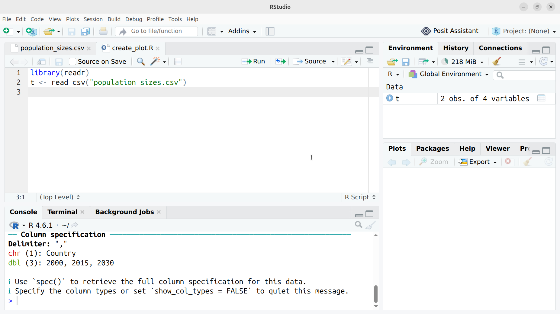
You have now read the file in R. The file is read and turned into
a table you can work on. The table is called t.
Reading the data is described in Chapter 7: Data Import.
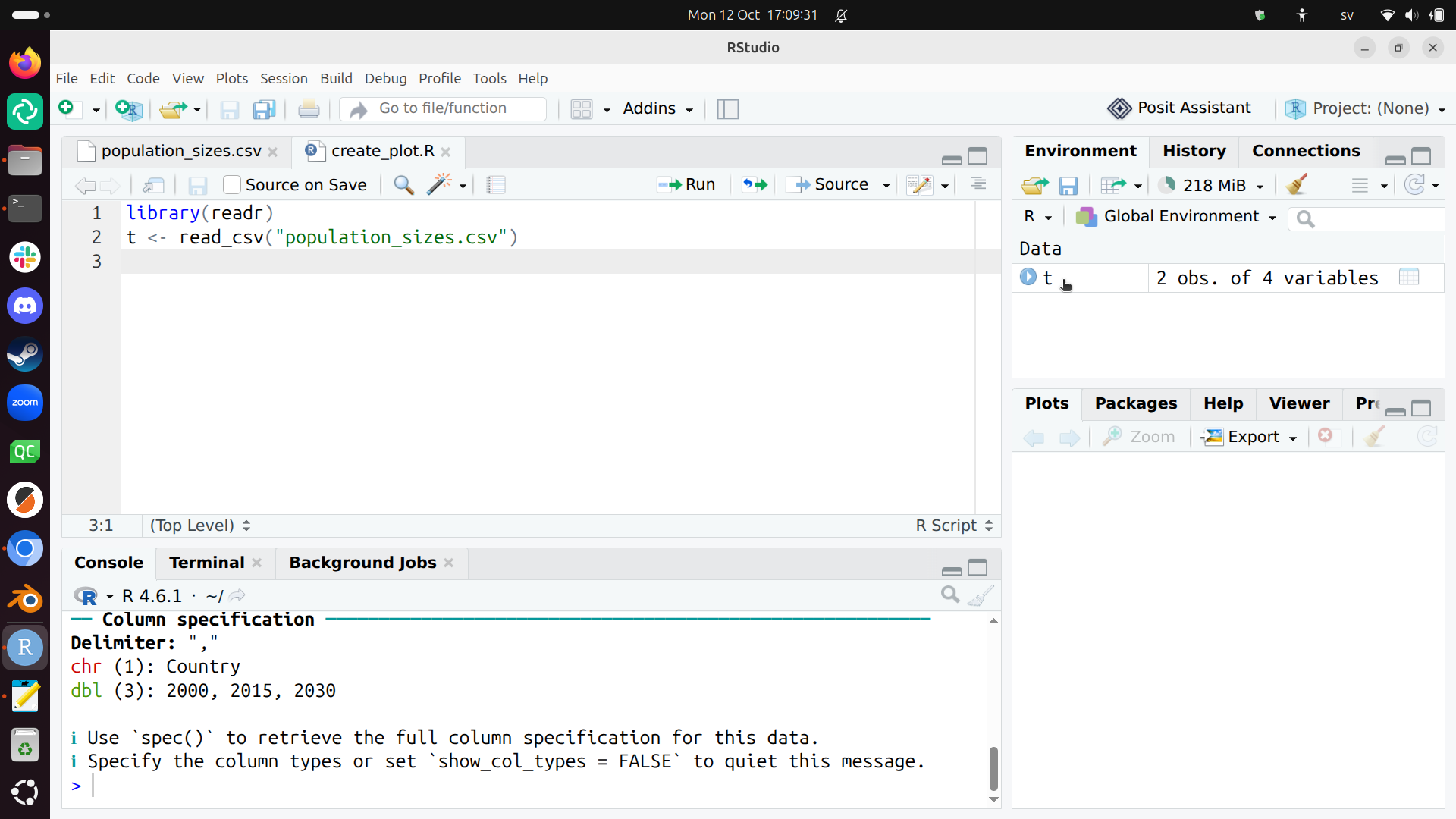
Because we use RStudio, we can easily see the data we have loaded in
computer memory: at the right-side of the screen, double-click on t.
Where do I need to click?
Double-click on t here:
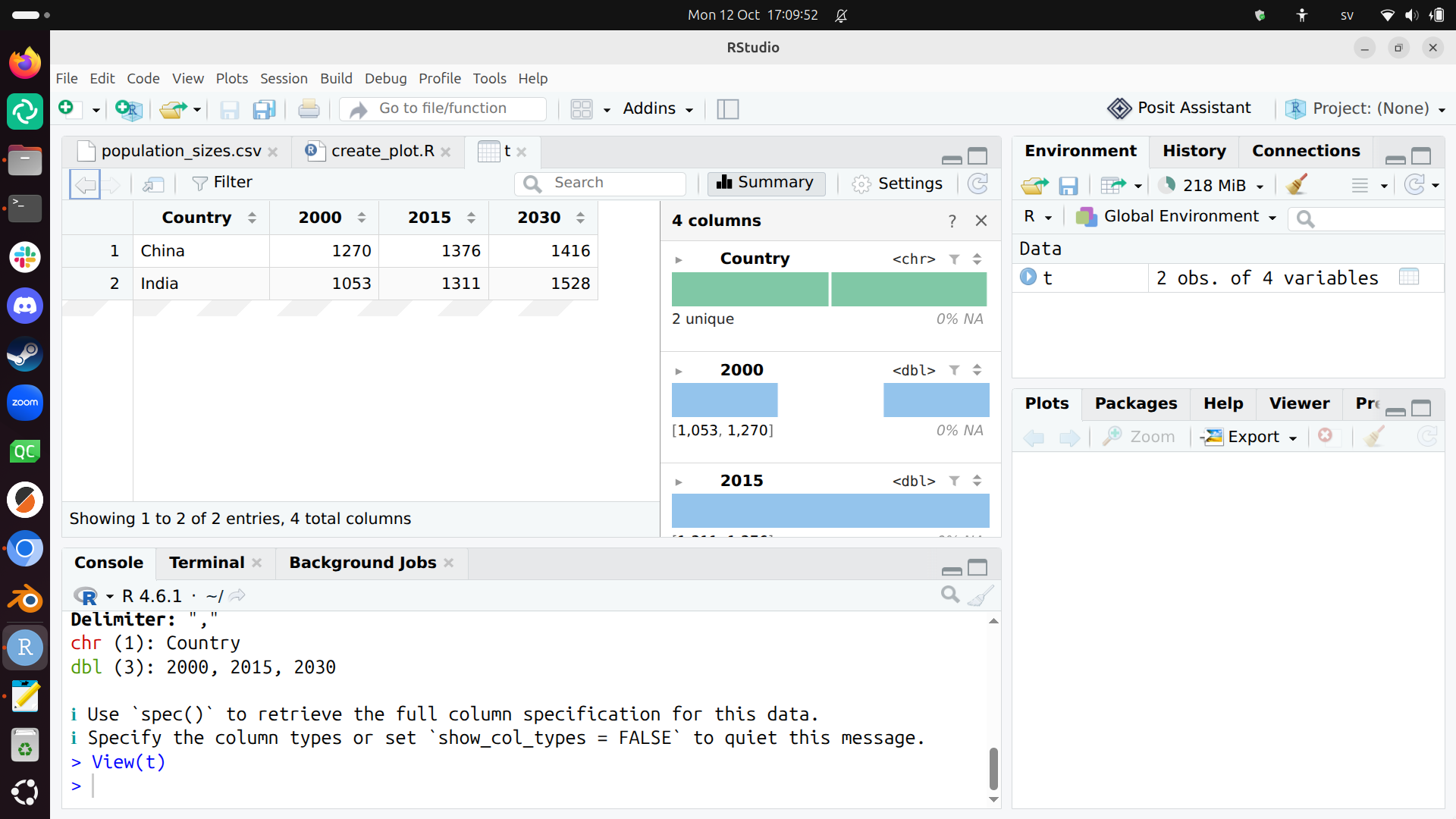
You will now see the table called t, as well as some summary information
What does that look like?
This looks similar to this:
3. Tidying the data
The data must be transformed to be tidy, which holds these features:
- Each variable is a column; each column is a variable.
- Each observation is a row; each row is an observation.
- Each value is a cell; each cell is a single value.
Our data is not tidy yet:
| Country | 2000 | 2015 | 2030 |
|---|---|---|---|
| China | 1270 | 1376 | 1416 |
| India | 1053 | 1311 | 1528 |
Our data is not tidy yet, as we have three observations per row:
- The population in each in the year 2000
- The population in each in the year 2015
- The population in each in the year 2039
In R, we can make this tidy in many ways, for example:
library(tidyr)
t <- t |> pivot_longer(
  cols = c("2000", "2015", "2030")
)
Add this code at the end of the create_plot.R script and run it.
You can now observe that t is tidy like this:
| Country | name | value |
|---|---|---|
| China | 2000 | 1270 |
| China | 2015 | 1376 |
| China | 2030 | 1416 |
| India | 2000 | 1053 |
| India | 2015 | 1311 |
| India | 2030 | 1528 |
Where do I need to click to see t again?
Double-click on t here:
Transforming the data is described in:
4. Cleaning the data
Now we need to do some data transformations:
names(t) <- c("country", "t", "n")
t$country <- as.factor(t$country)
t$t <- as.numeric(t$t)
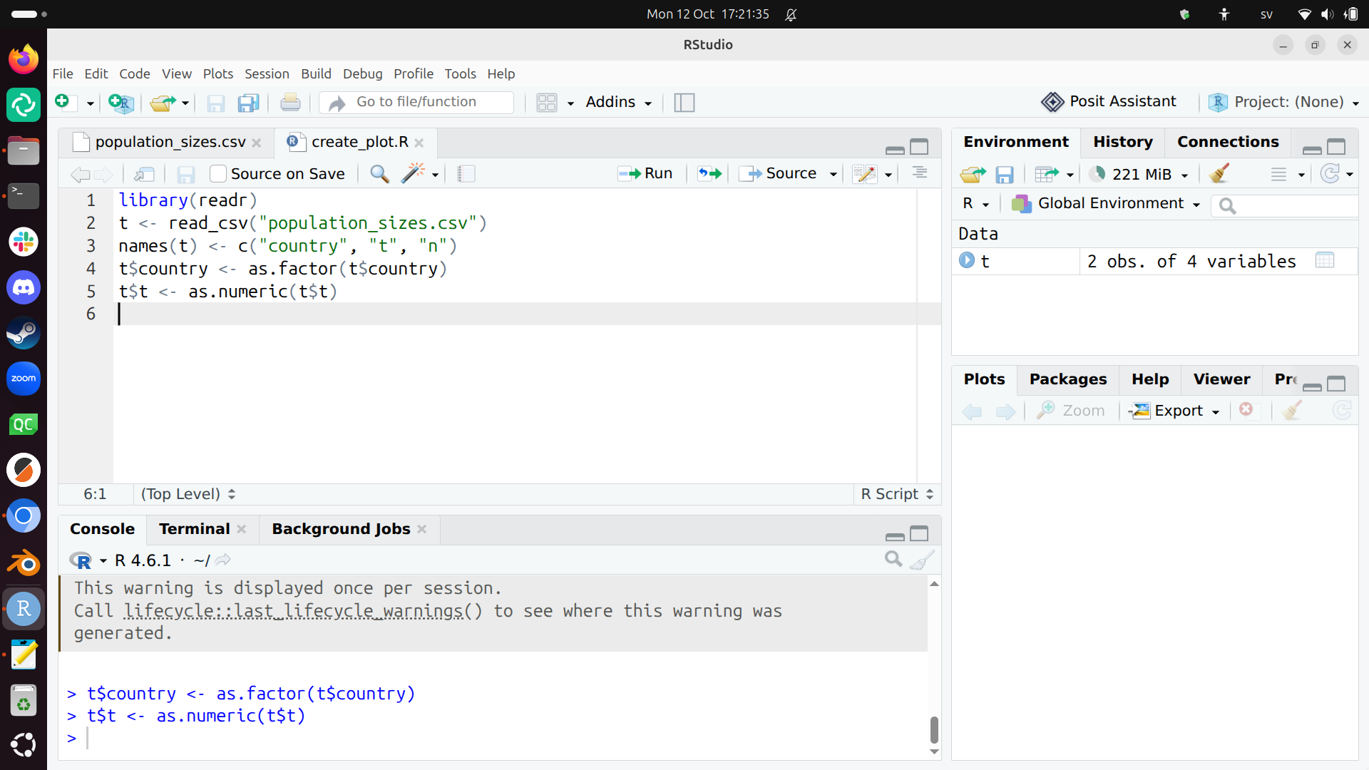
Add this code at the end of the create_plot.R script and run it.
What does that look like?
This looks similar to this:
What we have just done:
- We set the column names of
ttocountryandtandn - We set the
countrycolumn to be categorical: countries are categorical, in this case, eitherIndiaorChina. The technical term is that a country is a factor. Using factors is described in Chapter 16: Factors - We set the
tcolumn to be numeric, as years are numbers
Now the data looks like:
| country | t | n |
|---|---|---|
| China | 2000 | 1270 |
| China | 2015 | 1376 |
| China | 2030 | 1416 |
| India | 2000 | 1053 |
| India | 2015 | 1311 |
| India | 2030 | 1528 |
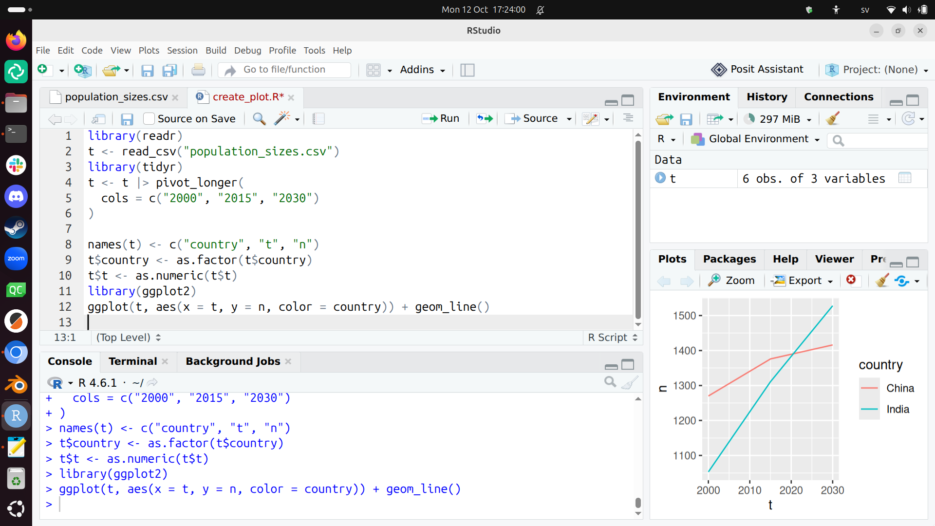
Plotting this now works:
library(ggplot2)
ggplot(t, aes(x = t, y = n, color = country)) + geom_line()
Add this code at the end of the create_plot.R script and run it.
What does that look like?
This looks similar to this:
5. Saving the plot
After having plotted the plot, it can be saved as such:
ggsave("my_plot.svg")
ggsave("my_plot.png")
Add this code at the end of the create_plot.R script and run it.
6. Refine
The plot looks like this now:
You can refine it in many ways:
- Refine the SVG in another tool
- Refine the generation of the plot
For example, in R:
ggplot(t, aes(x = t, y = n, color = country)) +
  geom_line() +
  geom_point() +
  scale_x_continuous("Time (year)") +
  scale_y_continuous("Population size (million)", limits = c(0, NA)) +
  labs(title = "Population size in time", color = "Country")
Add this code at the end of the create_plot.R script and run it.
Now the plot has proper labels:
Refining the looks of your plot is described in:
As there is so much to tweak, you definitely need to search the web and/or use an AI.
Exercises
Exercise 1
Do the steps of the 'A typical project visualization' section yourself, by copy-pasting.
Read the chapters if needed and/or search the web and/or use an AI to get what you need.